

As evaluators, we know that if we want data to be used for learning and adapting, the data itself must be easily accessible. We’ve found that visualizing data increase motivation, trigger emotion, and aid comprehension. One technique is visual storytelling: an approach for understanding MERL data through visuals.
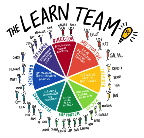
- Visuals are by far the quickest way to convey information from one source to another. It takes our brain far less time to understand a visual than if the same information was conveyed via text. I created this visual of my team at USAID LEARN. It has our team’s Insights Discovery scores grouped together to help us understand each other’s working styles so we can be a more effective team.
- We not only process visual information faster than text, but visuals stay in our memories longer. I created the visual above to help others quickly and easily see which bureaus within the United States Agency for International Development (USAID) have learning agendas. This visual has helped our team and others understand the extent to which learning agendas were being used across the Agency and helped to identify opportunities for further collaboration with operating units.
- Visuals help us distill complex information and share it out. I created the visual below to synthesize qualitative data from over fifty interviews about the most common path for creating a learning agenda. I created this to share out with those in the development community who were interested in creating their own learning agenda – so they could quickly learn from the experience of others and know where to start.

These are just a few examples of how visuals can help us SEE, literally and figuratively. Specifically, they help us:
- get a sense of what the data is telling us
- evaluate the data & apply an analytical understanding
- engage with the data to learn and adapt accordingly
Let me give you an example of this process from my work at USAID LEARN. Our mission is to help USAID become more of a learning organization. Our research shows that people are integral to that process.
I created the visual below to synthesize the evidence we have gathered to support our theory of change. At its core, the visual shows that people are change agents for collaborating, learning, and adapting. We call these people champions.

We collect a lot of data on our champions and use visuals to aid in our learning & adapting. These are three different types of visualizations:
- To get a sense of who they are, we use a socio-gram of our champions and which organizations they are from and how much USAID LEARN has contributed to their work.
- We evaluate our own technical assistance data to make sure we are learning and improving our support to champions.
- We use visuals to engage with champions. I created this visual based on a reflection session with champions. They participated in the content generation & design of the visual and used it to reflect on what they were learning together.
In our work with visualizing data, we’ve found that if participants are involved in the creation of the visual itself, they are more likely to learn and adapt based on the data. For example, we recently held a “Data Headlines” activity with our team to use visuals to internalize our data.
Here are some of the takeaways we have from using visuals to learn and adapt based on MERL data:
- Just like design – form should follow function. There are different types of visualizations that are best for sensing data, evaluating information, and engaging with others about data.
- Demonstrate value of visualization – don’t assume it. Not all data is meant to be visualized.
- Trial and experiment to find out what resonates and works for you and your team.
By Katherine Haugh, USAID LEARN

This is an excellent article…however, I would like to see it expanded to include the customer component. As currently reflected, this addresses only the supply-push side of the equasion. This needs to be directly linked to the demand-pull side of the equation. Ultimate success requires both.
My experience over the past 25 years in international development demonstrates that if the recipient of USAID’s development efforts are not equally thought out and committed to the change, there’s a reasonably high probability that the target results in the investment will not be ealized or sustained over time.
A complementary article addressing the demand-pull side with similar treatment would be a wonderful addition—adding even further value.